Olark’s Q4 2023 Accessibility Progress Report

Happy New Year! We just returned from our winter break and are excited to share the accessibility work we completed in the past couple months.
Simplified Headings within Conversations
When people use assistive technology to navigate, headings act like an outline for the page. In our new Agent Console, we’ve made changes to simplify the heading structure within conversations to make it easier to move around.
Before, there was a visually hidden heading before each message or event in the conversation. This often resulted in too many headings (if you have a long conversation, it could be hundreds!), making it impossible to find the section you’re searching for.
To reduce the number of headings, we simplified it so there is a heading for the date the messages happened on and then added a subheading below the date each time the next message is a different type than the previous.
Given this snippet of a conversation as an example, it is easier to see the difference.
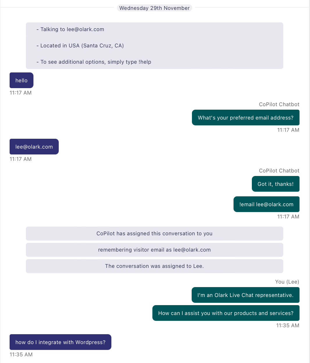
There is a chip that says Wednesday 29th November. Then a block of information about the user that Olark has from previous conversations.
Then the user and a bot go back and forth several messages.
After that, there are several blocks of information describing that the bot is now assigning the conversation to the agent and who the user is.
Then the agent and the user send messages back and forth.
With the previous headings, people who use screen readers would have these headings:
- Wednesday 29th November
- Conversation info
- User said
- Agent said
- User said
- Agent said
- Agent said
- Conversation info
- Conversation info
- Conversation info
- Agent said
- Agent said
- User said
Now, the headings would be:
- Wednesday 29th November
- Conversation info
- User said
- Bot said
- User said
- Bot said
- Conversation info
- Agent said
- User said
This makes it easier and more efficient to jump between larger sections of the conversation when looking for a specific message.
Reducing Screen Reader Clutter
One accessibility tester noticed that as they navigated through our new Agent Console, their screen readers would announce things as “groups” and “separators” very frequently, to the point where both words no longer communicated useful information about the page!
To improve this, we conducted an audit of all the places where groups or separators are used and spent time to determine where these roles provided any unique contextual information or if they can be marked as decorative. One example of this was that each message was previously marked up to be a group, so as you navigate through the list of messages in a conversation, screen readers would announce each individual message as a group. In this instance, the message being a group does not provide any information to the user so it was safe to remove.
The updated experience is much improved— now when there is a group or separator, users will know that it is important for navigating the page or understanding how to interact with a control.
Small Wins
In addition to these larger projects, we’ve implemented fixes based on the helpful feedback from users and accessibility testers on areas where we can improve. Our goal is not only to meet WCAG criteria but also to create a product that our users love, which would be much more difficult without user feedback, so thank you and keep speaking up!
Improved Visually Hidden Text
Cleaning up our visually hidden text is the perfect example of a small win because these are simple fixes with potentially massive impacts on the screen reader experience. This quarter, we decided to fix several issues with visually hidden text, like menus with inaccurate names, headings that were too vague, and adding visually hidden text in certain table cells.

The trickiest fix was determining what the visually hidden text for the collapse button in the sidebar should be. When a user clicks the button, the sidebar switches from the expanded view to a collapsed view, which only shows the icon for each button. For a blind user, nothing functionally changes between the views.
Initially, the button said “Toggle expanded view”, which was a little too vague for people to understand. After a long discussion with an accessibility tester, we decided the toggle button should have the text “Minimal sidebar layout”. While this is a seemingly small change, we hope that it better conveys the intent of the button to all users.
What’s on the Horizon
Now that we had time to rest over the holidays, we’re ready to get back to work! Some improvements to look out for this quarter are:
- Redesigned status alerts for better visibility, with a focus on improvements for users with low vision.
- Continued migration of pages to the new olark.com from the old inaccessible site
- More specific page titles in the new Agent Console to make navigation clearer
Keep an eye out for our accessibility updates, it’s going to be a great year. Until next time!